People who know this stuff (source unclear), say that we remember:
10% of what we read
20% of what we hear
30% of what we see
50% of what we see and hear
70% of what we say
90% of what we say and do
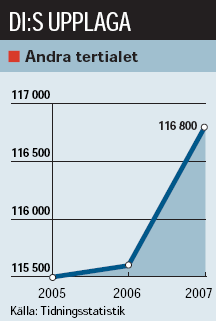
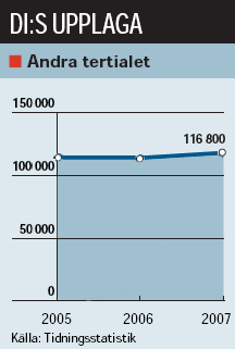
That is one reason why participation is so important in today’s marketing communications. But it also means that images have more impact than plain text. So when a newspaper illustrates a news story with a chart, it needs to be especially careful not to doctor the statistics in a way that the chart gives a different impression than the text. In today’s Dagens Industri, the paper illustrates an article about its own increase in circulation. The increase is only one percent but it looks like the number of subscribers is skyrocketing because the baseline of the chart is 115,500 instead of 0, a common trick to make small increases look big. See my manipulated chart to the right and tell me which is closer to the truth.
See also Blind Höna (in Swedish) about the same phenomenon.
Tags: statistics, newspapers, media, tidningar, statistik. Ping.