Instagram continues to bring out new updates to its app every week now and the change I blogged about a few days ago has already been removed again. I love Instagram and I check the app several times per day. In the latest update there has been a change to the design of the activity feed.
The tab that used to be called “news” is now called “you” and for some time the notifications (likes, comments or follows) have been presented in a quite condensed feed. Images to the right had no white space between them. Before that, the images had rounded corners and also some white space between them. The latest look made it possible to squeeze in more notifications on the screen since each notification took up less space.
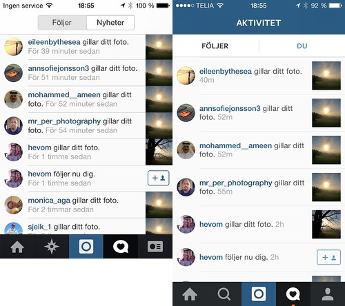
New look is wasting precious space
But as of yesterday, the feed has a new look again and the white space between images is back. That means that each notification takes up more space and that is not good. If you are a user with lots of interactions, you get loads of notifications and you don’t want unnecessary scrolling if you can avoid it. The new look is wasting precious screen space. Here’s the difference between the previous design and the new one.
Even on a smaller screen iPhone 4 to the left, you see more interactions than on the larger screen iPhone 5 to the left.
I hope they will revert this change and go back to the previous look.